Wednesday, December 16, 2015

Personal Project

Personal Project Review

The scope of this project originally was to create a story about a cat that has a dream that he saves the Royal Cat Gem of his kingdom by growing wings and diving off the cliff that the gem fell down. I later realized that it was going to be a lot harder than I thought to create a cat that could walk on two legs, so I decided to change the character to a worm mainly because I really enjoyed the wiggle worm project. I then thought that the idea of a worm trying to rescue a precious gem was a little to weird for the story so I
decided to create a new species. Enter the Dragonpiller, a half caterpillar half dragon species. Although I changed the story from its original point, the background and landscape I had imagined I kept for my Dragonpiller because they matched the story of the Dragonpiller. However transferring my Photoshop projects to After Effects caused a lot of problems and parts of my project were deleted multiple times, which resulted in me having to cut out some of the extra effects I wanted to originally add. One thing that I still am planning on going back and adding is a spout of fire that the Dragonpiller shoots out to help showcase the whole idea of it being half dragon instead of it just growing wings. One cool thing that I learned along the way is how to create a repeating falling background for one of the scenes in my project. There were a few times that I kind of forgot how to use the puppet pin tool, but luckily my friends were able to help me figure things out again. I would definitely have changed the color scheme of my Dragonpiller next time because the deep purple and bright yellow combination didn't really fit too well for me and I wish that I could've changed it before finishing the animation. I would keep the background, landscape, and the falling background the same because those things really worked well for me.I don't know if we are using After Effects again, but if we are I will remember to never change my Photoshop files once they have already been uploaded to After Effects because that will screw up your entire project. Overall though, I was pretty happy with the way it turned out, but there are definitely some things that I could fix and I hope to have a chance at fixing those in the near future.

Monday, December 14, 2015

Technical Tutorial

So today I am going to teach you how to make a repeating fall background in Adobe After Effects.
1.) First you create your background in Photoshop and set it to the desired dimensions for your project. 
2.) Next you have to import that file into After Effects as editable Photoshop layers.


3.) After that you have to copy and past the image three times in your composition and stack them on top of one another. After that you have to click and drag the spiral icons next to each image layer and then drag them to the layer you want to parent it to.

4.) After linking these layers to a parent function you have to create a node and link the layer that has the other layers attached to it to that node. After that you move the node with keyframes in the desired direction to get the repeating background effect.
If you did everything right, this should be what it looks like.
And there you have it! One repeating background for you.

Is 2d Animation Dying?

In this article, the author discusses briefly the history of 2d and 3d animation, how both these types of animations are used today, and how animators are becoming more common. The author agrees with the statement that 2d animation is dying. She says that 3d animation is more common because people like it more. With 3d animation you can better show emotions and movement without making look like plastic or wood. She also says that the only thing keeping 2d animation alive is TV, mainly because with 2d you can create more in less time while telling a good story. She is part of her own animation company called Optical Image and has numerous years of animating under her belt. She also references data collected in an article by Jeffrey Katzenberg to further support her argument. The author, Melanie Tauchmann, uses a variety of sources and her own company experience to make every claim she says, which is her main strength in the article. She is also very strong in addressing her arguments clearly an professionally. Another thing is that she does acknowledge the other side and does her best to present her side without completely bashing the other side. Although she has many strengths her one main weakness that all her paragraphs seemed to be very short and shallow. Overall the author says that 2d animation isn't as popular and is slowly losing ground to 3d animation. As someone who is has used 2d animation and a little bit with 3d animation I think these points are very well made and carry their own weight in how effective they are in describing the differences between the two styles of animation. The author's arguments do support the main claim because she explains how 3d animation nowadays is better and more common than 2d animation. After reading this article I felt like it reinforced my own opinion about 2d and 3d animation, but looking at this article from a neutral perspective it is very convincing. I can use this newfound knowledge to look for an available job in animation, as it's harder to get a 2d animation job than 3d animation. Overall I think this was a really well thought out argument and the author did a very good job at making her claim on the topic.
The Article: http://www.digitalartsonline.co.uk/features/creative-lifestyle/turf-war-is-2d-animation-dying/

Tuesday, December 8, 2015

More Masks


These were the photoshop masks that I made. I used more of a blur to create a better swinging affect on the girl. With the scuba I chose a more transparent part of the background to make it appear as though the word scuba is a reflection from the surface.

Shadow of a Can

For this project I made a shadow for the Sprite can to make it seem like a realistic object, but in reality it is only a 2d object with a shadow of the can to make it appear 3d.

Floating Mountain


In Photoshop we used a rock formation and clouds to create a scene that makes the rock formation appear to be floating. We also used other background images to add to the floating affect.

Monday, December 7, 2015

Logo


This is my custom logo. I chose a simple yet meaningful design. I used my initials as the center piece to create a feeling of friendliness along with incorporating my name into the logo. The initials are inside a circle as a sign of comfort and protection, because the logo would be used for a job in psychology. Speaking of psychology, the color yellow is a color of intellect and creativity which are two crucial parts of being a psychologist. Overall it's a nice cozy design and nothing too sore on the eyes, it turned out as well as I could've hoped for.

My process was to just use Illustrator and tweak shapes to see if they would look good in certain modes. The circle for instance, is actually a 3d circle shifted to look like an uneven circle. The text is also in 3d to add depth to the logo and make it match the circle.

Wednesday, December 2, 2015

Famous Logo Recreation

For my logo that I recreated, I wanted something with a simple look and design, but was easily recognizable. So I chose the Dominoes logo because of its simplistic look and newly remade logo.


The logo on the left is the original and the one on the right is the one I made with my custom wordmark. I simply made shapes that were scaled off the size of the original, and then I moved them into position using smart guides and transparent layers.

Painting in Photoshop

Painting in Photoshop is not an easy task to set up. You have to create a custom brush and style it to fit your needs. In my paintings I used the very wet, heavy load setting to mix my colors together. I also used the Dry setting to get some extra colors on the pallet to mix with the background. I made two separate paintings, one of a water spout over the ocean and another of an unnamed mountain. It was a simple task of mixing the colors and creating new styles until I was satisfied with the end result.


Friday, September 4, 2015

Professional Project Review

This animation was of Mike and Sulley from Monsters inc. It was about how Mike got a new car and he was showing it off to Sulley before going to work. The story was that Mike got a new car and was wanting to show off to Sulley all of it's new features, but he didn't really know how it worked. This was told by Mike not knowing which buttons to press either towards the end of the video. I really like how the animators made the pair interact so well with each other. The way they made Mike and Sulley interact with one another clearly gave the impression that they had been friends for a very long time. I would like to put that into one of my animations someday. One thing that I noticed straight away was that their shadows always were following them. If they had a shadow, it was mimicking their every move. With the worm animation I am creating, I also learned how to create a shadow for my worm. I felt the creators did a very good job on character interaction. The two characters played off one another and the whole animation went very smoothly. However I feel that they maybe could have given the cars control panel more screen time, as we were only given a brief glance at what it actually looked like. Overall I thought that this was a really well made animation and I really enjoyed it.

Pencils and Custom Item


This is the pencil that I created using the instructions. I am really happy with the way it looks, and I don't think I would change anything on it. The can is something that I wanted to create the appearance of light on my can. I also messed around with creating half objects so I was able to put two half pencils into my can.
This is my own custom pencil set.  I used the colors of KU, KSU, and MO for the pencils. I also put them into a balanced triangle shape to show that they are all part of the same but they can meet up at a point. For the can I made it a blue and white color to represent the Royals, as they are also a huge part of Kansas.
For my own creative piece I made a phone with earbuds playing music. I love to listen to music and I love technology so I figured I could create something that represents both of these things. I also used light blue and pink as colors because I think that those two colors would look pretty cool when merged on the same object.

Thursday, August 20, 2015

What is Graphic Design?

To me, Graphic Design is a way of communication through the images, colors, and textures of the world. Graphic design is a way that images and graphics can relay emotions to me so that I make connections to the emotions that are being presented. Colors are very controlling because each color has it's own story and emotion attached to it, which is used to help draw people in and make them feel a certain way or make another connection with the color. Textures of a graphic are also very important because it helps us to physically feel the emotion and the message that is trying to be relayed through the graphic.

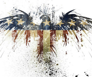
There was a time where I saw a graphic that had a red, white, and blue eagle painted it on it with the bottom of the eagle fading into the colors and that reminded me of getting Eagle Scout in Boy Scouts. The second connection I had was at the Nelson Atkins in their ancient cultures exhibit. Someone had submitted their own graphic to what the native american hunting sessions looked like, which made me think about my family because I have a little bit of native american heritage in my family. Third was a giant globe at the CNN center in Atlanta. The globe was just so massive and it had smooth parts with rugged countries on it. This made me realize that the world is a massive place with it's own rough spots and smooth patches. Finally, I was driving around Denver and I saw a graphic of the Rocky Mountains. This reminded me that I was finally home and that there is so much beauty in Colorado that you can't find anywhere else.


What is Graphic Design?

Wednesday, May 20, 2015

E9 Final

The Geowatch Review

Fig.1

Our Goal:

My groups overall goal of this project was to make a product that is useful in everyday life, innovative, cost efficient, and eco-friendly. This took us a lot of planning and and redesigning to finally get a product we were satisfied with. After scrapping a lot of our original ideas, we finally came up with the Geowatch. The actual creating of the product was a little difficult because we all had different opinions on what the watch would actually look like and it's base functions. As previously stated, we had to redo a lot of our initial designs because they didn't really fit our image too well, and the same goes for the packaging, which was a nightmare to finally put together. 


Personal Review:

Even with all the setbacks and restarts we had to do, I felt like I learned a lot from this project. For instance I learned how to make a better website and in faster time for an overall great finished product, as seen in Fig.1. The other thing that was very important for me to learn was how to make complex shapes in Google Sketch-up like spheres and rounded objects. Although the project was a success in my eyes, there are still a few things I could do better. These things include spending more time on the packaging, paying closer attention to detail, and better time management for the production of our video. Also there were times that I should have made more time to help out my group mates and take a break from what I was doing so I could help them with what they were doing. There are many things I would have changed in the way I did things, but there are also a list of things that I wouldn't change. Out of all the things I wouldn't change, the number one thing would be my work scheduling. It is very hard to work on two major aspects of the project at a time, and time management is a crucial step involved in the process. I felt like I was working really hard and did my best to stay organized and on task. Finally, I wouldn't change my approach to this product. My approach was to utilize as much of the resources that were available to me to create a product that was outstanding. It involved a lot of research and learning how to create complex shapes, as demonstrated in Fig.2. Overall I believe this was a very well put together project, that I benefited from, as well as learning how to work well with other people.


Fig.2

The Video:


Our commercial was a very tiring process and involved multiple reshoots to get that "just right" shot. The editing of the video was a very challenging task as I had to edit out background noise and trim the clips to make it run smoothly without a lot of jumping around. In the end, our group used Kierstyn's video because we though it was the best video at the time. Kierstyn and I worked the most on the actual filming, using Jared and Ben as the main actors, while putting ourselves into the video as well. I believe the commercial was a huge success and accurately portrayed what our product was.


Thursday, April 23, 2015

GeoWatch Final Product

Our Product is the GeoWatch Traveler. It is a teleportation watch that can transport you anywhere that you want to go to. Say for instance you are having a pretty rough day at work or school and want to relax, you can just put in your destination and relax at the beach for a few hours. The Traveler is a more fuel efficient and eco-friendly way of transportation. Our video was a testimonial of all the happy and satisfied customers and their opinions on the traveler. We implemented cut to make it seem like you teleported and a few more effects to really make it work.

Link to the Video


Saturday, March 7, 2015

Color psychology

The two shower gels I chose were Axe shower gel and L'Oreal for kids. The Axe bottle was white which represents a number of things. White can represent purity, innocence, sterility and wiping the slate clean. It is the fourth point that I think fits the Axe bottle perfectly. Because Axe is a shower gel, it is used to clean things, this reminds me of wiping the slate clean because you are washing away the day and starting fresh. The L'Oreal bottle is red, the color of energy, excitement and warmth. This shower gel is aimed towards kids, which is why red is such a perfect color, because it energizes the kids, it makes them excited, and most of all it will make them feel overall a little more happy.

Wednesday, February 25, 2015

Photoshop projects

In this project I overlaid multiple photos and adjusted the opacity of them to make it look like one big picture. I also used the clone stamp tool to remove light poles and to move grass to cover up cars. I also had to resize pictures to make them fit in the overall picture. Finally I used text types to create giant letters and to wrap them in the photo.
In this project I learned how to use the magic wand to change colors on a symmetrical plane, use the clone stamp tool to create a "moving" effect, and how to trim down an image to make it look nice.

In this project I learned how to edit a background image, place a text wrap on the background and then make that text gradient and fit the picture.

In this project I used the magnetic lasso tool to crop out the raven head and paste it into the original picture, then I had to copy the other pictures, resize them, and put them in place while lowering the opacity levels.

Wednesday, February 4, 2015

What is Graphic Design?

What is graphic design? Graphic design is a type of art style that is used to make logos, color wheels, and so much more! Graphic design is an outburst of your creativity. When designing something, you can make it as crazy and colorful as you want, or sleek and snazzy. Overall, it is a way of expressing something using colors and shapes, with a creative twist to draw people in.

Monday, February 2, 2015

Font Personality

The font style I got was Archer Hairline. This font describes me as emotional, understated, progressive, and disciplined. I feel like this really describes me because I have all of these traits and use them a lot more than I think. I am constantly showing a variety of emotions, but sometimes can get a little out of hand. Next I am pretty understated, in my opinion. I am a pretty subtle person and am pretty relaxed, but I can be easily overwhelmed by huge tasks or other big events. Then I am very progressive because I am constantly moving forward and I love to explore new ideas and use them in everything I do. Finally I am very disciplined because I am a rule follower and I don't get out of line or out of hand too often.